Chapter 11 - Custom CSS and JavaScript
Rules cover behaviour. Appearance beyond the built-in formatting options, and behaviour the rule engine does not offer, come from small CSS and JavaScript files stored inside the template. This chapter shows where those files live, how they are loaded, the screentip trick that lets you target controls from CSS without touching the view XSL, and three ready-made files you will see in most Qdabra starter templates.
11.1 Resource files
Open the Resource Files ribbon tab. It lists every file packaged in the template: style sheets, scripts, images, and the XML behind qRules and XTPs.
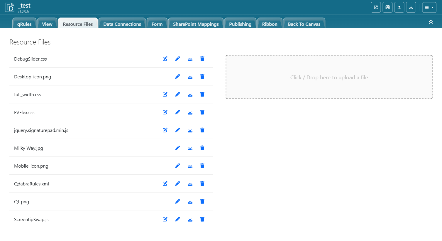
| Action | How |
|---|---|
| Add a file | Click or drop onto Click / Drop here to upload a file. |
| Edit text files in place | The pencil icon opens an editor with syntax highlighting for .css, .js, .xml, .json, .txt. Save writes back into the template. |
| Download | The download icon exports the file, for example to reuse in another template. |
| Delete | The trash icon. Remove the matching LoadResource action too. |
Uploading a file with an existing name replaces it; that is the normal way to ship a CSS fix.
11.2 Loading a file at start-up
A resource file does nothing until it is loaded. Loading is a qRules command; put it on QdabraRules > finishedLoading, the first rules to run when the form opens (Chapter 7, section 7.2):
- Data Fields > QdabraRules (Secondary) > select finishedLoading > Rules button.
- Add a rule, for example
Load Responsive Design CSS. - For each file add Run a qRules Command with
"LoadResource /name=<file name with extension>", or build it in the Command Builder (Chapter 3, section 3.3.6).
The sample template loads its files in three rules at the top of the finishedLoading list: FVFlex.css and ScreentipSwap.js, then ToggleClass.js and DebugSlider.css, then the signature scripts. Resource loaders belong above Run Dynamic DCs; they touch no data connections.
LoadResource parameters: /name (required), /type script or style when the extension does not say, /unload to remove a previously loaded file, /allowexternal and /useproxy for files served from outside the template.
11.3 Turning a screentip into a CSS class
FormsViewer renders a control's ScreenTip as the HTML title attribute. That makes the screentip the easiest hook for CSS: you set it in the designer, per control, without editing the view. Two ways to use it:
- Directly:
[title="my_main"] { ... }in your CSS. Works, but the user sees the text as a tooltip. - Promoted to a class with ScreentipSwap.js (newer training labs ship the same script as
SwapClass.js): after every render the script finds sections, expression boxes, and picture buttons whose screentip starts withmy_, copies the screentip into the element'sclass, and clears the title. Your CSS then uses.my_main { ... }and no tooltip appears.
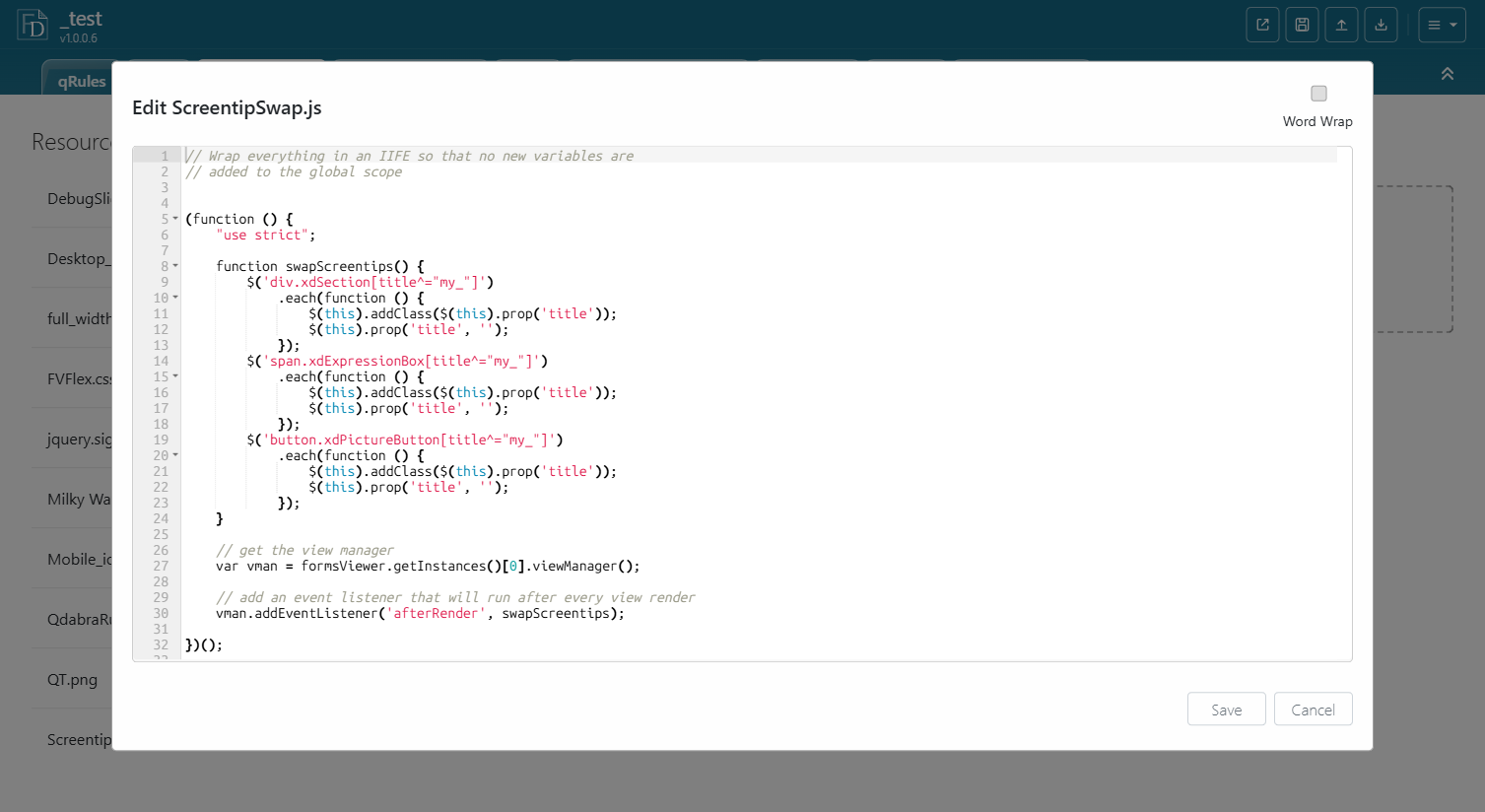
Rules of the convention:
| Rule | Detail |
|---|---|
| Prefix | The screentip must start with my_, case sensitive. Anything else is left alone, so ordinary screentips keep working as tooltips. |
| Name | The screentip text becomes the class name verbatim: my_container, my_responsiveTable, my_overlay. Use CSS-safe names, no spaces. |
| Where to set it | Select the control, Properties tab, ScreenTip. |
| Which controls | Sections, expression boxes (calculated values), and picture buttons in the shipped script. Ordinary buttons are not covered (the designer does not let you set a screentip on them); use a picture button, or wrap the button in a section and target the section. Extend the selector list if you need text boxes or others. |
| Verify | Open the form, press F12, search the Elements panel for the class name. |
Because the class is on the section, you can style everything inside it with descendant selectors: .my_container .xdTextBox { ... }.
11.4 Relative widths instead of fixed widths
InfoPath layouts carry fixed pixel widths on tables, columns, and sections, which is why a form designed at 800 px stays 800 px on a wide screen and overflows on a phone. The sample template ships full_width.css (the training labs distribute the same file as fullwidth.css or full-width.css; the name inside your template is what LoadResource needs), a short style sheet that overrides those widths with percentages:
table { width: 100% !important; }
col   { width: 100% !important; }
.xdSection { width: 100% !important; }
.xdRepeatingSection.xdRepeating { width: 100% !important; }
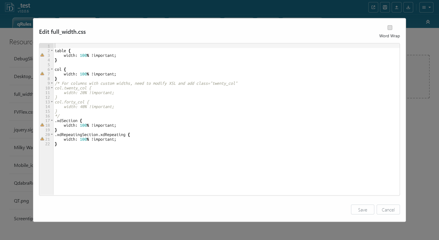
Load it with "LoadResource /name=full_width.css" and the layout tables stretch to the container. For columns that must keep a proportion, the commented section shows the pattern: give the col element a class in the view and set width: 20% !important on that class. FVFlex.css, also in the sample template, goes further and rebuilds the layout with flexbox for a responsive form.
11.5 Custom JavaScript as a qRules command
JavaScript in a resource file can register new qRules commands, so the rest of the form calls them from ordinary action rules. ToggleClass.js is the shipped example:
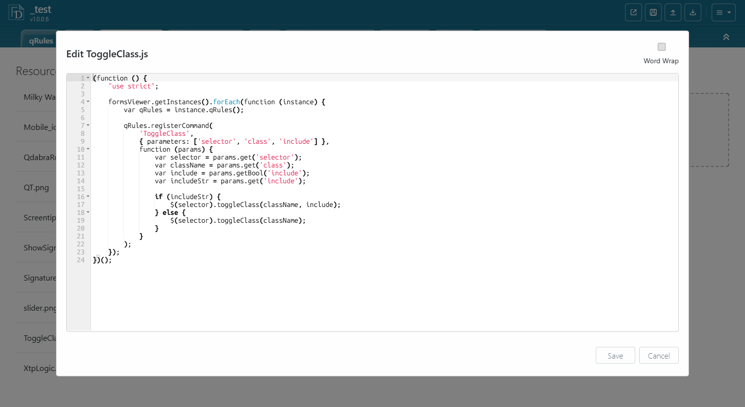
The shape of such a file:
(function () {
    "use strict";
    formsViewer.getInstances().forEach(function (instance) {
        instance.qRules().registerCommand(
            'ToggleClass',
            { parameters: ['selector', 'class', 'include'] },
            function (params) {
                var include = params.get('include');
                if (include) {
                    $(params.get('selector')).toggleClass(params.get('class'), params.getBool('include'));
                } else {
                    $(params.get('selector')).toggleClass(params.get('class'));
                }
            });
    });
})();
Using it from a rule: FormsViewer exposes every command registered this way under the name with a Custom prefix, so the rule calls Run a qRules Command with "CustomToggleClass /selector=body /class=showOverlay /include=true" to add a class, /include=false to remove it, or no /include to toggle. Combined with a screentip class, this is how the sample template's Debug Slider opens: "CustomToggleClass /selector=.my_debug /class=open" on a picture button, and how the overlay lab in the training material shows its panel.
Notes for writing your own:
- Wrap the file in an IIFE and register inside
formsViewer.getInstances().forEach(...)so it works when several forms are on one page. - Parameters arrive through
params.get(name); useparams.getBoolfor flags. - The name you pass to
registerCommandis not the name you call. FormsViewer prefixes it withCustom:ToggleClassbecomesCustomToggleClass,OpenUrlbecomesCustomOpenUrl. A rule that calls the bare name is not recognized as a command. - Load the script before any rule that calls the command, and keep it above Run Dynamic DCs with the other resource loaders.
11.6 Putting it together
A typical modern-UI starter:
- Resource files:
full_width.css(orFVFlex.css),ScreentipSwap.js,ToggleClass.js, your owntheme.css. - finishedLoading rule
Load UI resources: oneLoadResourceaction per file. - Screentips
my_header,my_main,my_actionson the main sections. theme.cssstyles those classes and their descendants.- Buttons that need to show or hide a panel call
CustomToggleClasson amy_class.
11.7 Summary
- CSS and JS live in Resource Files and are loaded with
LoadResourceon finishedLoading. - Give a section a screentip starting with
my_and ScreentipSwap.js turns it into a CSS class. full_width.cssreplaces InfoPath's fixed widths with percentages.- Scripts can register qRules commands; ToggleClass is the pattern to copy, and it is called as
CustomToggleClass.
Back to the table of contents.